
To thrive in a job market within an information society; a hard copy resume will barely suffice. With the world interlinked by the web, via Facebook, LinkedIn, and Google, etc; one has to brand themselves to stand out amongst the competition. Not only do they have to keep their image crisp and clean for potential employers, but they should possess an online portfolio for which they can enhance their experience.
Today, anyone can be a publisher with the amount of tools and resources accessible to everyone. To have an edge over the competition, it would be pointless not to take advantage of these benefits and stand out with a technological competitive edge. The purpose of the project is to demonstrate how the knowledge I have acquired throughout my master’s program can be applied in life and how an interactive resume enhances the job search of a traditional resume.
Following are principles have been applied to my project.
The logo design process was extensive as I wanted to find the perfect image that fully encompassed the image I wanted to portray as a professional.
The color of psychology played a large role in the development of my brand logo. The original idea was to incorporate blue, purple and black into the design to project emotions.
First, I incorporated the logo into a business card.

Then, it was used for consistency in branding within my resume.

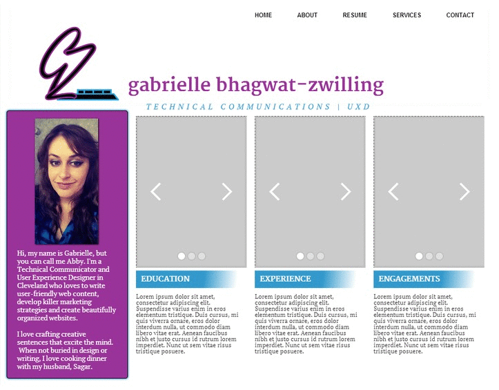
Finally, the shades of the colors were incorporated into my infographic resume design.

Finally, I decided to save the older version of the logo for GabComm.com and after many iterations, I took a turn towards a more clean, flat design which has become my logo today. The blue alone provides enough emotion in itself to stand alone. My design is less cramped and utilizes more negative space.
I will eventually incorporate the older version of the logo into my upcoming project, my services website, GabComm.com.
After building a brand image, my project redirected to the user experience design process.
In the next phase, I began laying the groundwork for the structure of the overall site to get an idea for what wireframes that I would be using and to further define the scope of the work that lay ahead.
First, I developed a concept map to get a feel for the site structure and how exactly the content could be categorized.

Next, I developed a tentative site map to get an overview of how many pages I would need and how the hierarchical structure would pan out.

After getting the big picture of the hierarchical structure from the site map, I created the content inventory to give me an overview of how my portfolio samples would be organized in the smaller picture.

After everything was mapped out in my head, I began sketching the layout – here’s a rough draft of my initial wireframes, which as can be seen are far from what has been used on the site.

I continued my project with several more versions of the wireframes and eventually they led to the development of the global navigation structure for the information architecture.
After creating the user experience design preliminary drafts, I continued evolving the design of my wireframes.

Initially, my web design included the original logo within the header.


As the design evolved, my global navigation evolved to fit the layout.
After exhausting the design process, I started designing and developing my website.
First, I developed a concept map to get a feel for the site structure and how exactly the content could be categorized.

Eventually, I decided to carry my design over to Bootstrap. Webflow is an outstanding tool, but Bootstrap allowed me to add more customization and interactivity to my site. Check out my Bootstrap version.